Decorators
The public properties of components are displayed through the inspector, provided that the types of those properties are supported. It is possible to configure how a property is displayed or edited in the inspector using decorators. You can also use decorators to configure how public properties of tools are displayed.
The supported decorators are provided below:
- The
@Icondecorator specifies the icon for a component. - The
@Namedecorator specifies the name for a component. - The
@Labeldecorator specifies the label for a component property. - The
@Unitsdecorator specifies the units assigned to a numeric property. - The
@Dropdowndecorator displays an enum property. - The
@Flagsdecorator allows multiple enum options to be selected. - The
@Sliderdecorator displays a slider for a numeric property. - The
@LocalFeaturedecorator specifies that a property should allow feature selection. - The
@PhysicsLayerdecorator specifies that a property represents a physics layer. - The
@Limitdecorator specifies which limits of a limit pair should be modifiable. - The
@Categorydecorator groups properties into a category. - The
@Serializabledecorator specifies whether the component property should be serialized or not. - The
@Visibledecorator specifies whether the property should be displayed in the inspector or not. - The
@Readonlydecorator specifies whether the property should be displayed as readonly in the inspector. - The
@Optionaldecorator specifies that the property value is optional (nullable). - The
@OptionalArraydecorator specifies that the property value is an optional (nullable) array. - The
@RequiredArraydecorator specifies that the property value is an array. - The
@HandleArraydecorator specifies that the property value is an array of handles. - The
@Filterdecorator specifies that the dropdown for the property should be filtered according to a callback filter function.
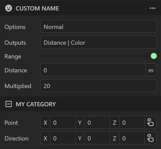
Example
An example is provided below that shows how to apply some decorators to public properties:
import { Component, Entity, Handle, Vec3, Quat, Slider, Name, Icon, Units, UnitType, Dropdown, Flags, LocalFeature, LocalFeatureType,
         Category, Visible, Readonly, Label, HandleArray } from "prototwin";

export enum Options {
    Slow,
    Normal,
    Fast
}

export enum Outputs {
    None = 0,
    Distance = 1 << 0,
    Color = 1 << 1,
    Brightness = 1 << 2
}

@Icon("mdi:at") // Provide an icon for the component from https://icon-sets.iconify.design
@Name("Decorator") // Provide a name for the component instead of using the class name
export class MyComponent extends Component {
    @HandleArray(Entity)
    public entities: Handle<Entity>[] = [];

    @Dropdown(Options) // Display the enumeration options as a dropdown
    public options: Options = Options.Normal;

    @Flags(Outputs) // Allow multiple enumeration options to be selected
    public outputs: Outputs = Outputs.Distance | Outputs.Color;

    @Slider(0, 10, 20) // Slider from 0 to 10 with 20 steps
    public range: number = 0;

    // Only display the property if distance output is enabled
    @Visible((component: MyComponent) => (component.outputs & Outputs.Distance) === Outputs.Distance)
    @Units(UnitType.LinearDistance) // Display units of linear distance
    public distance: number = 10;

    @Readonly(true) // Display the property as readonly (required if there is no setter)
    @Label("Multiplied") // Provide a custom label for the property
    public get multipliedRange(): number {
        return this.range * 2;
    }

    @Category("Frame") // Group the property into a category
    @LocalFeature(LocalFeatureType.Position) // Allow point to be configured using feature selection
    public position: Vec3 = Vec3.zero;

    @Category("Frame") // Group the property into a category
    public rotation: Quat = Quat.identity;

    constructor(entity: Entity) {
        super(entity);
    }
}
Inspector Display
The decorators are used by the inspector to control how the properties should be displayed or edited: